If you ask me, choosing the right color for artificial flowers starts with a very simple thing: you. Not with trends. Not with rules. But with your personal taste, and the color scheme you already love in your home. Look around: Which tones repeat in your room? Are you drawn to soft, neutral colors, earthy warmth, or a playful contrast? You can often find your favorite colors in your closet, your favorite mug, or the artwork on the wall. Artificial flowers are simply a natural extension of these, or sometimes, the perfect little contrast.
Style tip
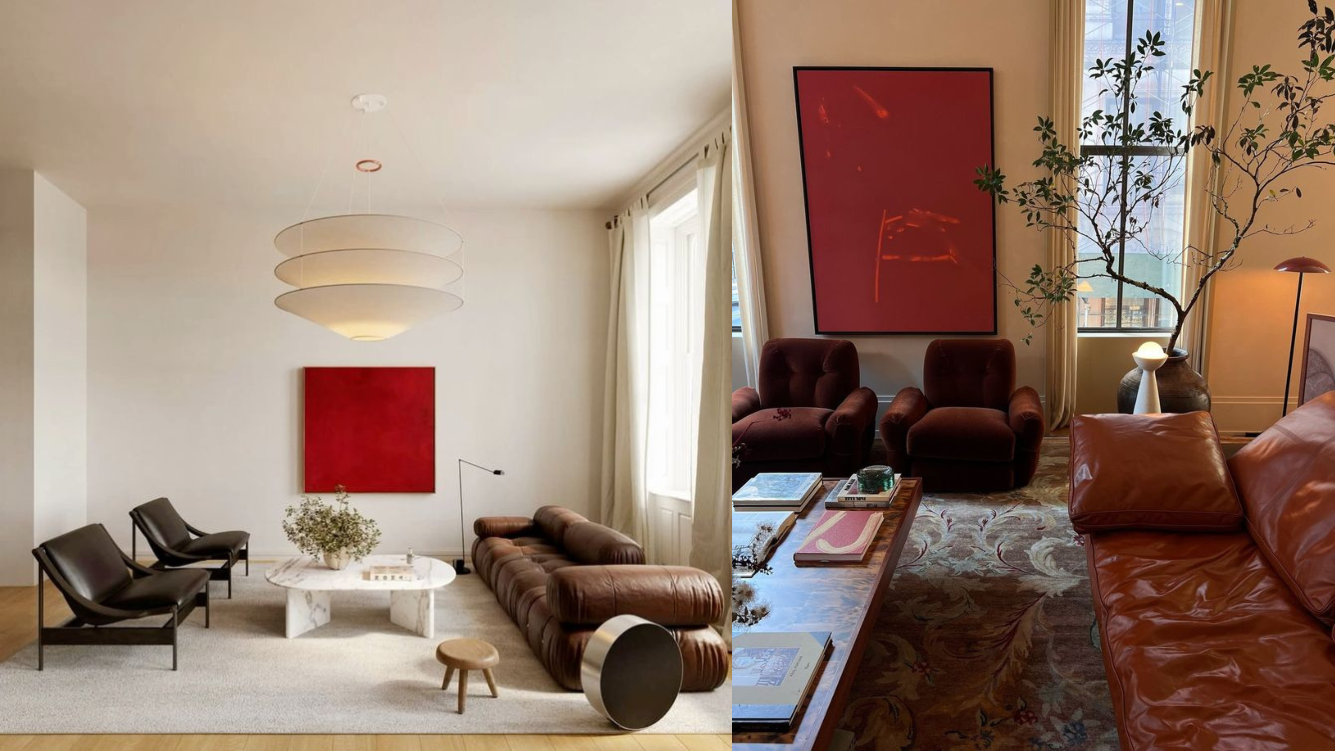
Something I learned from fashion: To make bold colors appear less harsh, combine them with other tones. White with red makes the red shine. Red with camel or navy appears calmer and more elegant. The same applies to interiors. A monochrome home with red flowers – and they immediately become a real eye-catcher. In a colorful room, however, the same red flowers blend harmoniously – less drama, more balance.
 In this picture, you can see what I mean: Red in a calm, tonal interior looks powerful and draws all eyes. Combining red with other warm colors, however, creates a completely different mood. There's no right or wrong—just what you like. I encourage you to experiment with colors and find out what works best for you.
Color world 1: Warm, earthy, wintery calm
This winter, it's all about warmth and depth: brown, terracotta, and burgundy. Colors that radiate comfort, elegance, and quiet beauty - like candlelight and long dinners. Of course, you don't have to change your entire home for that. Accents work wonders: a terracotta bouquet, a few new pillows, a ceramic bowl: small details, big impact. Perfect matches:
-
The Terracotta – the soft glow of the late afternoon sun.
-
The Amber – warm tones full of energy and life.
-
The Plum – deep, elegant and a little mysterious.
Small styling decisions, big impact.

Pillow: Nordic Knots. Candle: Loewe. Bag: Liffner. Vase: Studio Vraco. Vase with flower: Solo Collection No.3 Silkhaus. Big bouquet: Silk-ka (our Premium Artificial Flower Partner). Bouquet The Plum: Silkhaus.
Color world 2: Minimal & Monochrome
The Japandi-inspired calm remains. Clear lines, soft tones, light and shadow. It's less about contrast and more about subtle nuances. Perfect matches:
-
The Cream – pure, soft and ideal for a peaceful living experience.
-
The Moss – a muted green, timeless and grounding.
-
Or quite minimalist: two to three individual stems – a moss branch or a hydrangea blossom – in a sculptural vase.

A moss or wood branch in a quiet vase.
Color world 3: Art Deco contrast
A little retro, a little bold. The Art Deco influence is back – with contrasts, curves, and a touch of glamour. Dark tones meet gold, velvet meets glass. In this mood, artificial flowers become small works of art, like design objects with character. A perfect match:
-
The Violet – expressive, elegant and with a touch of art.
Placed on the sideboard or dining table – and the bouquet becomes a statement in the room.

The Violet at home with one of our customers
Your home, your color world
Whether you live in calm beige tones or a colorful mix, artificial flowers express your mood. You don't have to follow any color rules, just trust your eye. If it feels right, it's right. That's the beauty of artificial flowers: They allow you to play, change, and constantly reinvent. Because good color choices aren't about perfection, but about what you love.


